BRAND, RE-BRAND, RINSE, REPEAT

Capturing a brand and all that it represents and turning it into a visual label is a difficult thing to do. It took us many attempts and a very long time to get to the presentation of Deeds Brewing and Quiet Deeds that you see today.
With the imminent launch of our Dark Deeds range, I wanted to walk you through the evolution of the Quiet Deeds brand and where we are now taking it with the release of the first member of the Dark Deeds family.
WE LIKE IT, WE DON’T LIKE IT
It all began in 2011 when we began to focus fully on establishing our own brand of craft beer. After hunting for a marketing agency we settled on a large well known agency and after 6 months we narrowed the name to Quiet Deeds.
The name for us resonated: it made us think of a quieter simpler existence focusing on the things that matter versus the manic and busy existence we wrestle with in modern life. We also liked the idea of achieving great deeds but doing it quietly without boasting or recognition, which is a personal mantra for Dave and I.

Some of the original “Quiet Deeds” concepts
However trying to encapsulate the name “Quiet Deeds” into a visual logo or label proved challenging.
The name was captivating but difficult to transfer into a visual form.
SOME INITIAL CONCEPTS – MAY 2012
The first iteration of the label:

This bottle design uses the visual representation of finger over mouth to symbolise silence. Its simplicity and space on the label also highlights the “Quiet”.
We felt this design was too obvious, generic, not craft and we ultimately discarded the design but kept the name. Which left us no choice but to look for a different agency that could interpret the name into a label. We were hoping to find an agency that was more graphic focused rather than marketing focused and younger, bringing more energy to the label.
We settled on a boutique agency that went a completely different direction.
QUIET DEEDS GOES TO MARKET
Moving away from the serious and vanilla look we did a 180 to a more youthful, vibrant and somewhat quirky feel.
The original concept:

The first iteration of the bottle label has a retro feel, using the clouds/bubbles of beer to wrap around the Quiet Deeds text, with beer style in the middle.
Overall we felt this design was too busy and difficult to read, with too many conflicting colors.
After numerous iterations of the label design we landed on the following:

The initial feedback we received on the label was polarising: some people loved it and some people disliked it, which we didn’t mind. The major issue we had though was the feedback that the label was difficult to read. It’s a simple lesson in hindsight, but issues such as visibility and readability are a no brainer; we certainly did not make our lives any easier.
GO TO MARKET MARK 2
In 2015 we went back to the same boutique agency to make the label more legible. Which they did.

START AGAIN
After 3 years of the original Quiet Deeds label, in 2016 we decided to do a complete re-brand. This also coincided with us finding a brewery site and kicking off our planning for our eventual brewery.
We wanted to create an overarching brand that encapsulated the brewery itself, calling out the location “Glen Iris” and showcasing the building’s iconic “sawtooth roof”. Deeds Brewing was born as the master brand, making Quiet Deeds the sub-brand containing the portfolio of beers we brew.


All beer labels were redesigned as part of this process adopting patterns inspired by dazzle camouflage. Dazzle camouflage was used in wartime to mask ships. These dazzle patterns were used to hide great deeds being done under the radar, which reflected our brand perfectly.

An example of a wartime ship with Dazzle pattern
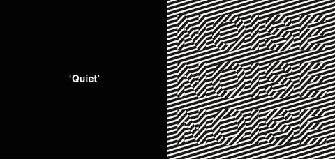
The design further refined makes a contrast between visual noise and quiet.

Quiet versus noise is the centerpiece of this design
Every one of our beers now and in the future will have a corresponding pattern that represents the particular beer style in some way.

DEEDS BREWING - QUIET DEEDS AND … DEEDS
That leads me to Dark Deeds.
With our overarching brand, we are able to have a family of themed beer brands. Quiet Deeds still adorns most of our brewery’s releases, but we are branching out. Dark Deeds is the first iteration of this vision.
Dark Deeds will be the home of big, bold and boozy dark beers - no light here 😉


The first beer we are releasing under Dark Deeds is The First Horseman, our Imperial Stout. This is a reference to The First Horseman of the Apocalypse, symbolising a conquest of dark over light.
It’s been quite a journey for us so far, but we feel that Deeds Brewing is only just getting started 😉
Cheers
Pat.
0 comments

